
 Arguably the most important page on any computer or mobile device is the homepage. Spb knows that and have spent significant time and money on developing the best interface for your phone in the market today. They already had a winner in version 2.0 which was shipped by many device makers such as Sony Ericsson, Toshiba and others.
The new version, Mobile Shell 3.0, is absolutely stunning visually and also when it comes down to be able to personalise it.
Here’s the first quick look.
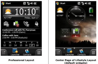
My HTC Touch Diamond has a brilliant home page and the famous flipping clock is a work of art. Yet it was not long before I discarded the whole Touch Flo exercise in favour of the Mobile Shell from Spb. However, as good as it was in version 2, I still longed for more customisation. I basically had two homepages to accommodate all the functionality that I wanted in one home screen. Interestingly enough, MS3 also accommodates two homepages: one for the professional (which is remarkably similar to the current version) and one termed the Lifestyle Home page. This is essentially a widget-based and picture-based background, extremely well suited for personalisation. Most people would want to have one home page for work and another one for leisure. The good thing is about both home pages that they play nice with one other so it’s very easy to flip flop back and forth.
 |
Installation
Make sure that you have plenty of room on your device as installation takes nearly 8 MB. Installing the new Mobile Shell went without a hitch until I got the message that installation was unsuccessful and all because there was no trusted certificate! Because Spb is such a major player in this field I would have thought that by now they would have procured that certificate from Microsoft even though it is apparently expensive to buy. It reassures people when they install key software… Well, the installation worked perfectly regardless.
A very nice feature is the new Carousel Screen: you can easily see which screens are before and after the current one that you have selected. Everything is geared for easy navigation. You’ll find big buttons, smooth finger scrolling and fantastic Contacts Management.
But It Is Simple to Use?
It is inevitable that personalisation comes at the cost of simplicity. That’s always my biggest worry with any application but Spb reassures us that they spend a lot of time making the application more intuitive. For instance you can always get easily back to your home page to check the device status, not through task switching but simply by pressing the End Call or Home button. The same with launching any other application which is done through the Launcher. Most programs have their own labels which can be very handy initially. Later on you can ditch the labels altogether. I also found it faster to use.
Spb MS3 even has integration with Facebook, primarily as a source for great pictures for your contacts. I tried that and it’s amazingly simple: a 3 tap process once you got the pics in your mobile.
Pricing
For just shy of US$30 you can buy this program or go for half price if you already own the previous version. It’s a free upgrade if you bought 2.0 in the last three months. If you decide to go and upgrade Windows Mobile to 6.5 you will be pleased to know that Spb has already integrated much of the functionality that would be necessary to play nice with WM6.5.
Conclusion
The new Spb Mobile Shell 3.0 is a vast improvement over an already brilliant interface that we had in version 2. I particularly like the rotating carousel feature and integration with all the key functions you need in a Windows Mobile platform.
This application is so much more than just eye candy. It’s highly functional, very customisable and just plain fun to use. The price is not prohibitive either so go ahead and download it now! It’s released today (April 21).
Highly recommended.
